1. The HTML Element "details"
The HTML element "details" causes contents to be opened and closed again.
For this it is sufficient to write the following code:
<details><p>Collapsible contents</p></details>
However, you will get an error message if you test the HTML code in the W3C-Validator:
Error: Element details is missing a required instance of child element summary.
So in the next step I add the required HTML element "summary".
2. Accordion with "details", "summary" and "p"
I now insert the required HTML element "summary" into "details". This makes "summary" the child element of "details".
For example, if the HTML element "summary" is followed by a paragraph, this paragraph becomes the collapsible target. The appropriate code is:
<details>
   <summary>Title or heading</summary>
   <p>Here comes the collapsible text.</p>
</details>
This code passes the validation without complaint.
3. Design Open and Closed Accordion Differently
The HTML element "details" contains the attribute "open", with which you can set the respective status via CSS.

If the accordion is closed, the font should be normal, if it is open, the font of the title should be italic. Therefore I use CSS to address the attribute "open" of the HTML element "details". The CSS code for it:
/* Styling the font-style of the summary title */
details[open] summary {
   font-style: italic;
}
Using this accordion as an example, you can notice that the font changes from normal to italic as soon as the accordion element is opened.
4. Displaying Multiple Accordion Elements
If more than one element that can be opened is to be placed on the website, it is not sufficient to just put new "summary elements" under a "details element". For each expandable element, a "detail element" must be written into the HTML code:
<details>
   <summary>Title or Heading</summary>
   <p>Here comes the collapsible text.</p>
</details>

<details>
   <summary>Title or Heading</summary>
   <p>Here comes the collapsible text.</p>
</details>

<details>
   <summary>Title or Heading</summary>
   <p>Here comes the collapsible text.</p>
</details>
5. Replace Triangle with Plus and Minus
If you don't like the triangle as a status indicator, you can easily replace it with a picture or another character. Before I add some CSS to make the accordion look like an accordion:
CSS-Code
* {
    box-sizing: border-box;
}

img {
   max-width: 100%;
}

.details-wrapper {
   width: 75vw;
   margin: 0 auto;
   background-color: #E5E5E5;
   box-shadow:0 0 1px 2px #BFBFBF;
}
details {
   padding: .5rem;
   font: 1rem/1.2 sans-serif;
}

summary {
   padding: .25rem 1rem;
   font: bold 1.25rem/2 sans-serif;
   background-color: steelblue;
   border: none;
   border-radius: 3px;
   box-shadow: 0 -1px 1px 1px rgba(0,0,0,0.5);
   color:floralwhite;
   cursor: pointer;
   /*list-style: none;*/ /* Triangle not shown */
}
/* Triangle not shown - Style for Webkit-Browser */
/*summary::-webkit-details-marker {
   display: none;
}*/
summary::before {
   padding-right: .25rem;
   /*content: '+ ';*/  /* Instead of Triangle closed */
}
details[open] summary::before {
   padding-right: .25rem;
   font-style: italic;
   /*content: '- ';*/ /* Instead of Triangle open */
}

/* Styling the summary in case of open 'details' */
details[open] summary {
   font-style: italic;
   border-radius: 3px 3px 0 0;
}

.details-content {
   margin: 0;
   padding: .25rem 1rem;
   background-color: floralwhite;
   border-radius: 0 0 3px 3px;
   box-shadow: 0 1px 1px 1px rgba(0,0,0,0.5);
   color: steelblue;
}
.details-content p {
   font: 1.125rem/1.5 sans-serif;
}
In the following code I replace the triangle with a plus sign for the closed accordion and with a minus sign for the open accordion.
summary {
   ...
   list-style: none; /* Triangle not shown */
}
/* Style for Webkit-Browser */
summary::-webkit-details-marker {
   display: none; /* Triangle not shown */
}
summary::before {
   padding-right: .25rem;
   content: '+ '; /* Instead of Triangle closed */
}
details[open] summary::before {
   padding-right: .25rem;
   content: '- '; /* Instead of Triangle open */
}
6. Display the First Accordion Element Openly
If you don't want to present the first (or any other) Accordion element closed, but opened to the viewers, you insert the attribute "open" into the concerned HTML element "details":
<details open>
  <summary>Display the first Accordion element openly</summary>
  <p>Text</p>
</details>
Tipp
In order to place different content elements in the content area of the HTML element "summary", it is advisable to pack them into a "div-container" in order to be able to design them more easily. The code looks like this:
HTML Code
<details>
   <summary>Title</summary>
   <div class="details-content">
      <p>A paragraph</p>
      <figure>
         <img src="path-to-the-image.png" alt="This is a placeholder picture" title="This is a placeholder picture">
         <figcaption>This is a placeholder picture</figcaption>
      </figure>
      <ul>
         <li>List item 1</li>
         <li>List item 2</li>
         <li>List item 3</li>
      </ul>
      <p>This is a <a href="">Link</a> to nowhere.</p>
   </div><!-- end details-content -->
</details>
7. Browser Support
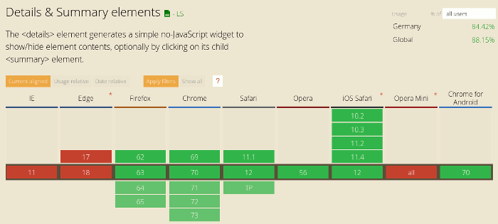
Unfortunately not all browsers support the HTML element "details" yet. Internet Explorer and Edge do not support "details", nor does Opera mini. All other current and popular browsers support the function of "details".
In browsers that do not support "details", the accordions are displayed open, so that you can use this feature even if it is not supported continuously. The content will be readable in any case.
On the website caniuse.com you can see which browsers support the HTML function of "details" or not. Here is a corresponding screenshot:
