26. June 2020
Image Captions with CSS Flexbox
Centering and Positioning Labels
With CSS Flexbox you can easily center a text over an image or position it at different places. And all this without much programming effort: Simply by positioning the corresponding text in a flexbox absolutely with:
position: absolut
The text can be moved both horizontally and vertically, giving you nine different variations:
- top left
- top center
- top right
- center left
- center center
- center right
- bottom left
- bottom center
- bottom right
That's all Flexbox allows for. However, these nine variants should suffice for most layout cases.
Approach
First, I define a HTML structure that takes the images with text. Each text-image combination is put into a box, which is declared as a flexbox.
So that the images are displayed responsively, I surround them with a grid, which I develop with CSS Grid Layout.
For the HTML elements I assign classes to be able to style them afterwards via CSS. The class names speak for themselves: I add the function to the prefix "box".
I get the images for the code online from picsum.photos.
Here is the HTML code for six examples:
HTML Code
<div class="box-grid">
  <div class="box-flex">
    <img class="box-img" src="https://picsum.photos/230/300?random=1" alt="Image form https://picsum.photos" title="Image form https://picsum.photos">
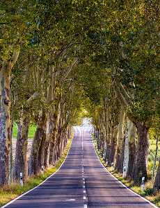
    <h5 class="box-caption">Top Center</h5>
  </div>
  <div class="box-flex box-flex-center">
    <img class="box-img" src="https://picsum.photos/230/300?random=2" alt="Image form https://picsum.photos" title="Image form https://picsum.photos">
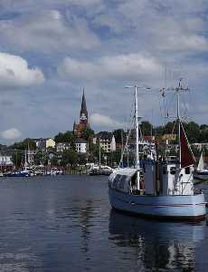
    <h5 class="box-caption">Center Center</h5>
  </div>
  <div class="box-flex box-flex-bottom">
    <img class="box-img" src="https://picsum.photos/230/300?random=3" alt="Image form https://picsum.photos" title="Image form https://picsum.photos">
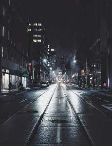
    <h5 class="box-caption">Bottom Center</h5>
  </div>
  <div class="box-flex box-flex-top-right">
    <img class="box-img" src="https://picsum.photos/230/300?random=4" alt="Image form https://picsum.photos" title="Image form https://picsum.photos">
    <h5 class="box-caption">Top Right</h5>
  </div>
  <div class="box-flex box-flex-center-left">
    <img class="box-img" src="https://picsum.photos/230/300?random=5" alt="Image form https://picsum.photos" title="Image form https://picsum.photos">
    <h5 class="box-caption">Center Left</h5>
  </div>
  <div class="box-flex box-flex-bottom-right">
    <img class="box-img" src="https://picsum.photos/230/300?random=6" alt="Image form https://picsum.photos" title="Image form https://picsum.photos">
    <h5 class="box-caption">Bottom Right</h5>
  </div>
</div><!-- end box-grid -->
You can see the whole code on Codepen.
Creating the Grid
I create a grid for the images, which is automatically responsive, with CSS Grid Layout:
CSS-Code
.box-grid { display: grid; grid-template-columns: repeat(auto-fit, minmax(250px,1fr)); grid-gap: 1.5rem; justify-items: center; margin: 0; padding: 0; }
How this works, I have explained in detail in my article How to Create an Image Gallery with CSS Grid Layout.
Absolute Text
The text is simply centered or positioned by setting the HTML element containing the text to absolute. I put the text into a headline "h5" and assign it the class "box-caption". To avoid an overflow, a maximum width and a word-break are set. Note that the parent element of the text – here "box-flex" – is marked with "display: flex".
The according CSS code for the text is:
CSS Code
.box-caption { position: absolute; max-width: 200px; word-break: break-word; }
Flexible Text
The images "img" and the texts "h5" are children or items of the "divs" with the class "box-flex". Thus they can be positioned using the CSS statements "align-items" and "justify-content". Whether "align" or "justify" is responsible for the horizontal or vertical position depends on how the alignment of the flexbox is defined: flex-direction: row or flex-direction: column.
I have declared the parent element "box-flex" as a "row"; thus I can move the text vertically via "align-items" and horizontally via "justify-content". Here is the CSS code for six variants:
CSS Code
/* Standard: Top Center */ .box-flex { display: flex; flex-flow: row nowrap; align-items: flex-start; justify-content: center; position: relative; padding: .5rem; text-align: center; font-size: 1.2rem; word-break: break-word; background-color: #333333; color: #d9d9d9; } /* Box: Center Center */ .box-flex-center { align-items: center; } /* Box: Bottom Center */ .box-flex-bottom { align-items: flex-end; } /* Box: Top Right */ .box-flex-top-right { justify-content: flex-end; } /* Box: Center Left */ .box-flex-center-left { align-items: center; justify-content: flex-start; } /* Box: Bottom Right */ .box-flex-bottom-right { align-items: flex-end; justify-content: flex-end; }
The Result
The result is a small image gallery with six pictures. The text above the pictures can be seen at six different positions. As standard I have set "top center" and derived the variants from there.
Image Gallery with Variants of Overlay Text

Top Center

Center Center

Bottom Center

Top Right

Center Left

Bottom Right
Positioning Multiple Texts on an Image
With the CSS statement "align-self" you can also place several texts on one image.
Here comes the HTML code for three variants:
HTML-Code
<div class="box-flex">
  <img class="box-img" src="https://picsum.photos/230/300?random=1" alt="Image form https://picsum.photos" title="Image form https://picsum.photos">
  <h5 class="box-caption">Top Center</h5>
  <h5 class="box-caption align-end">align-self: flex-end</h5>
</div>
<div class="box-flex box-flex-center">
  <img class="box-img" src="https://picsum.photos/230/300?random=2" alt="Image form https://picsum.photos" title="Image form https://picsum.photos">
  <h5 class="box-caption align-start">align-self: flex-start</h5>
  <h5 class="box-caption">Center Center</h5>
  <h5 class="box-caption align-end">align-self: flex-end</h5>
</div>
<div class="box-flex box-flex-bottom">
  <img class="box-img" src="https://picsum.photos/230/300?random=3" alt="Image form https://picsum.photos" title="Image form https://picsum.photos">
  <h5 class="box-caption align-center">align-self: center</h5>
</div>
  <h5 class="box-caption">Bottom Center</h5>
</div>
The CSS code for the three variants is quickly written:
CSS-Code
/* align-self: flex-start */
.align-start {
  align-self: flex-start;
}

/* align-self: center */
.align-center {
  align-self: center;
}

/* align-self: flex-end */
.align-end {
  align-self: flex-end;
}
The Result
The newly added text is placed here at three different positions; as you can see, several additional texts can be placed on the same image.

Top Center
align-self: flex-end

align-self: flex-start
Center Center
align-self: flex-end

align-self: center
Bottom Center
Links
Detailed information on the Flexbox concept: CSS-Tricks and Codrops
A cheat sheet for CSS-Flexbox: always useful!
The whole code on Codepen.
The pictures are from pixabay.com.