10.03.2022
Creating a Responsive Basic Form
An Easily Customizable Template for Your Own Forms
Here you will learn how to create a flexible and responsive form, that works perfectly on mobile screens. This template is suitable for many cases, because you can easily customize it to your specific needs.
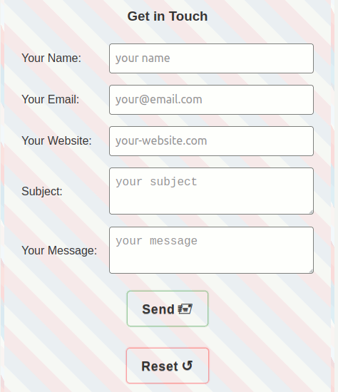
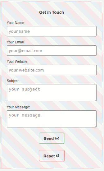
The following screenshots show the result of the form template for larger screens and for mobile devices.


If you are impatient, you can see the result on this Demo site. I added a background and border to it, reminiscent of an airmail letter.
I don't want to waste any more words, let's get right into the code for the form template.
The HTML Code
First let's have a look on the HTML-Code for the basic form template:
HTML-Code
<form action="" method="post">
  <h3 class="center-text"> Get in Touch</h3>
  <label>Your Name:
    <input type="name" name="name" placeholder="your name" autofocus required>
  </label>
  <label>Your Email:
    <input type="email" name="email" placeholder="your@email.com" maxlength="32" size="10" required=>
  </label>
  <label>Your Website:
    <input type="url" name="website" placeholder="your-website.com">
  </label>
  <label>Subject
    <textarea name="subject" placeholder="your subject" required=></textarea>
  </label>
  <label>Your Message:
    <textarea name="message" placeholder="your message" required=></textarea>
  </label>
  <button class="btn btn-send center-element" type="submit">Send Your Form</button>
  <button class="btn btn-reset center-element" type="reset">Reset</button>
</form>
Notes on the HTML Code
What does the HTML code mean in detail?
label: I am using the label element without the attribut for which refers to the the id attribut of the input element. It is not necessary, see Mozilla Developer Network:
Alternatively, you can nest the
inputdirectly inside thelabel, in which case the for and id attributes are not needed because the association is implicit.
autofocus: Sets the focus, and with most browsers also the cursor, to this line.
required: Filling in this line is necessary; it will be checked by the browser, no JavaScript needed.
type="reset": Deletes the entries in the form fields; it will be done by the browser, no JavaScript needed.
Please be careful when using the Reset function without asking whether the data should actually be deleted. This is best done with JavaScript.
The CSS Code
Now let's consider the CSS code for the form template in detail:
CSS Code
form {
  width: 90%;
  display: flex;
  flex-direction: column;
  margin: 0 auto;
  padding: 1 rem;
  background-color: floralwhite;
}

label {
  display: flex;
  flex-direction: column;
  justify-content: space-between;
  margin: .5rem;
}

@media only screen and (min-width: 600px) {
  label {
    flex-direction: row;
    align-items: center;
  }
}

input,
textarea {
  width: 100%;
  margin-top: .25rem;
  padding: .5rem;
  font-size: 1.25rem;
  line-height: 1.5;
  outline: none;
  border: 1px solid #7f7f7f;
  border-radius: .25rem;
  color: #333;
  transition: border .25s ease-in-out;
}

input:hover,
textarea:hover,
input:focus,
textarea:focus {
  border: 1px solid #fa8b8b;
}

@media only screen and (min-width: 600px) {
  input,
  textarea {
    width: 70%;
    margin-top: 0;
    font-size: 1rem;
  }
}

@media only screen and (min-width: 980px) {
  input,
  textarea {
    width: 80%;
    font-size: 1.25rem;
  }
}

.btn {
  padding: .75rem 1.25rem;
  font: 700 1.1rem/1.2 Verdana, sans-serif;
  letter-spacing: .05rem;
  text-decoration: none;
  text-shadow: 0px 1px 0px rgba(77,77,77,.5);
  background-color: transparent;
  border: 0;
  border-radius: .25rem;
  color: #333;
  transition: .5s;
}

.btn-send,
.btn-reset {
  transition: box-shadow .25s ease-in-out;
}

.btn-send {
  box-shadow: 0 0 2px 1px rgba(0,128,0,.7);
}
.btn-send:hover,
.btn-send:focus {
  box-shadow: 0 0 3px 2px rgba(0,128,0,.5);
}

.btn-reset {
  box-shadow: 0 0 2px 1px rgba(255,0,0,.7);
}
.btn-reset:hover,
.btn-reset:focus {
  box-shadow: 0 0 3px 2px rgba(255,0,0,.5);
}
Notes on the CSS Code
May be you ask yourself: Why did he write exactly this code?
Alright, let's look at why I use this code:
form
width: 90% is exemplary, just customize it to your needs;flex-direction:column: The formfields will be ordered on top of each other;margin:0 autofor centering the form.
label
flex-direction:column: The labels are displayed above the input fields and the textarea on small screens.
label @media only screen and (min-width: 600px)
flex-direction:row: The labels are displayed before the input fields and the textarea on bigger screens.@media: Please, adjust the min-width to your needs.
input, textarea
outline:none: This removes the outline of the browser settings.
input, textarea @media only screen and (min-width: 600px)
width: This makes space for the labels before input and textarea on larger screens.
input, textarea @media only screen and (min-width: 980px)
width: This makes space for the labels before input and textarea on even larger screens.
.btn (Button)
border:0: This removes the border of the browser settings.
.btn-send, .btn-reset
box-shadow: I use here box-shadow instead of a border; the reason is: if you hover a border and the border-width will grow, than 'you will have an undesirable visual jump from layout shift since the border will briefly increase the dimensions in those states', see moderncss.
You can avoid this effect withbox-shadow.
You can see the result on the Demo site for the form template.
You can also play around with the code on codepen.io. Have fun with it!